Ann Conner: Symphony Suite
These colorful prints of graphic shapes over wood grains are playful and celebratory of hue and texture
Reviewed by Robert Faires, Fri., Dec. 27, 2013


Flatbed Press and Gallery, 2830 E. MLK Jr. Blvd., 512/477-9328
www.flatbedpress.com
Through Jan. 4
Just where and when I first became aware of wood grain is lost to me, but I like to think it happened at my grandparents' home back when I'd sprawl on the floor with a coloring book and while away the hours filling in outlined shapes with the brightest, lushest colors in my box of crayons. Mom and Pop's big old house boasted some handsome pine flooring, which would've lain just beyond the edges of whatever book I was making my marks on, and surely the beauty of the whorls and knots impressed there were absorbed by my child's eye.
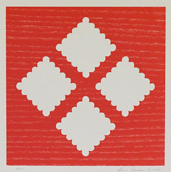
Having now seen Ann Conner's "Suite Symphony" exhibition, I'm inclined to think the printmaker came to her awareness of wood grain through a similar circumstance. The dozen prints that greet you as you enter Flatbed Press and Gallery are marked by the finely textured patterns of wood rippling and surging across the paper, all in exuberant hues – daffodil yellow, royal purple, powder blue, spring green, blood orange, aqua – that seem plucked from Crayola's super-size box. They invite you in with a cheery, childlike vibe, enhanced by the little white shapes with scalloped edges arranged in rows and diamonds across them. The circles and ovals suggest comic-strip cotton balls and thought balloons, and like the snowy voids in coloring books, almost beg to be filled in.
Moving through the hallways and rooms of the Flatbed complex, you can find samples of Conner's fascination with wood that predate these works from the last few years by a decade or more. In some of the older series, such as the Madrone and Forest suites of the late Nineties, the hues are often muted – grays, dark greens, and dusky violets – and the shapes – peanuts, jigsaw puzzle pieces – are little more than ghostly outlines over wood grains which loom like moody storm clouds, leaving the viewer in an autumnal world, the light fading and a chill coming on. But as Conner has moved forward in time, it's as if she's regressed to that time in life when we embraced color in all its variety – the brighter, the better – and the boldest of marks. The Brentwood and Rosewood suites, and the Bel Air, with its whimsically curvy shapes in goldenrod, violet, spring green, and aqua, are playful and celebratory in their colors and textures, and looking at them may drop some years off you, too: You may find yourself in search of a coloring book and that old 64 box of crayons.