‘Liz Ward: Aqueous’
In the exhibition 'Aqueous,' artist Liz Ward provides rippling watercolors and silverpoint drawings ideal for a wintertime dip
Reviewed by Rachel Koper, Fri., Jan. 13, 2006


Liz Ward: Aqueous
Women & Their Work, through Feb. 11
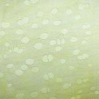
Take a wintertime dip into these rippling watercolors and silverpoint drawings by artist Liz Ward. Her art is based on either plant-cell structures drawn in a delicate, concise, and rhythmically soothing way or on underground rivers, rendered in more ravishing watercolors. Ward began with the silverpoint drawings 13 years ago, then added watercolors 10 years ago. She latched onto a topographical image in a newspaper and began painting aquifers. About half the aquifer pieces are based on real maps, though eventually she began to let the warping of the large papers influence the composition of her works. This is coolness. She is able to listen to the paper, take direction from the materials themselves. In the richly layered and quietly provocative show at Women & Their Work, Minor Aquifers (Deep Blue) demonstrates her mapping technique coming together with the linear qualities of her silverpoint petri dishes. It is the most recently completed work in this vividly consistent progression of works.
Ward's edge quality is a fine thing to see. Working from light to dark, she lets each shape dry on the cold-pressed, rough-cotton paper. She constructs gorgeous little color moments where one shade creeps up to another. Primarily she paints two sets of color rings: a light one, then a deep ultramarine blue or violet or an iron-oxide-heavy tone like the Lunar Earth pigment from Daniel Smith. She picks out several topographical spots for the darker "aquifers." The subtle color and value changes give the compositions an interesting light balance and a type of dialogue between two tones. To appreciate its strengths, it must be seen in person. The roiling texture of the bowing and stretching paper, combined with the gentle coaxing of the dark values out of aqueous forms, is the focus of the piece.
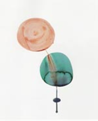
One nice thing about the show at Women & Their Work is that the smaller works serve as instructional bits for the more significant pieces. With the diminutive yet charming Flow Mix, the artist's intention is a technical mastery over two differently weighted pigments. Chemists could tell us why blue pigments always seem to absorb more evenly and quickly into paper (and why they generally fade faster also). Browns/anything-with-iron-in-it are coarser in grain and chunkier. Ward makes a blue circle and a brown one, then waits until a certain moment in dryness at which point she drags a little river down between the two. The brown drifts and perfectly settles on top of the cool blue tone. This loses the precious edge effect but highlights the mysterious separations that occur in solution. Timing is the key here, and Ward nails it. This large grouping of works is a quiet storm and shows off her patience and tenacity. Inspired and semimagical, this is great artwork.