


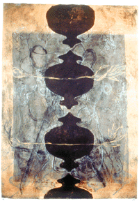
 Untitled (dark shapes/two lillies), 1993. Monotype, 42×28 inches. Published by Flatbed Press. |
our Austin tour “Fresh Ink,” the current exhibition in the Austin Museum of
Art’s downtown galleries. This is our community museum, I’d say, as we drove
around the block a couple of times, looking for a parking space, and this is a
taste of how artists in this region and beyond have made good use of the
printmaking resources and technical expertise available in this city. This is a
very good show.
“Fresh Ink” is an exhibition that fulfills a number of goals that a community
museum ought to embrace. First and foremost, it highlights regional artists
while placing them in a national context. Austinite Amy MacHugh Moen’s
mysterious little intaglios (especially Examination, a stone-and-plate
lithograph with intaglio) hold their own just fine in an exhibition that
includes Robert Wilson’s prints. The 96-inch high monotype with chine
coll� by New York artist Dan Rizzie towers above the prints around it
with its mysterious colors and playful curlicue shapes, but the monotypes by
local artist Sydney Yeager have equally beautiful painterly surfaces and subtle
colors.
In addition, this show highlights local commercial and non-profit facilities
that provide an important resource for the local art community and for artists
who come from far away to take advantage of their expertise and facilities. The
prints here by some 85 different artists exhibit a wide range of personal
styles and printmaking techniques, and prove the quality and skill of these
Austin print shops and UT’s Guest Arts in Printmaking Program. The exhibition
also reinforces the commitment of the individuals, non-profit groups, and
commercial galleries involved in publishing the prints. It validates the
judgment of curators and collectors who have added these prints and others to
private and museum collections across the country. For the record, I
certainly felt validated to find a handful of prints that I’ve purchased
over time in this museum exhibition.
My own love affair with the print medium began more than 30 years ago when I
was in art school. As I gouged wood blocks, dipped copper plates into acid, and
drew on huge lithographic stones, I loved the risk-taking, the reversed
imagery, the surprise of peeling a damp piece of paper off the press to see,
finally, the results of my labors. And then I began all over again, re-etching
the plate, scraping the stone. I suppose there is an element of masochism
inherent in the convoluted process of making prints versus a more direct medium
like drawing.
But when artists whose primary method of production is not printmaking work
with master printmakers in a local shop like Flatbed Press, Strike Editions,
Slugfest Printmaking Workshop and Studios, or Coronado Studios, they can bypass
the pain while retaining the joy of experimentation and discovery. Technicians
such as Flatbed’s Katherine Brimberry (whose mysterious print Heart’s
Garden is in the exhibition) work with artists preparing plates, pulling
proofs, editioning the final print, and suggesting ways to enhance the print to
reflect the intent of the artist. The process becomes truly a collaborative one
as the artist’s ideas emerge clothed in a new medium. “The artist makes all of
the artistic decisions regarding the image,” says exhibition curator Dr. Mark
L. Smith, “but is guided by the master printer regarding the technical aspects
of how to create it.”
By making prints, Austin painters such as Fidencio Duran (best known for his
public art project murals), Michael Ray Charles (whose paintings, big as
old-time circus posters on canvas, have a national following), and Peter Saul
(known for his large, brilliantly colored canvases) are able to produce work
that is smaller, more accessible in price, and yet still representative of
their personal vision. (Here, Saul’s black-and-white lithograph even allows one
to focus on his bizarre imagery without being distracted by his colors.)
Similarly, sculptors such as Luis Jimenez, James Surls, and Michael Tracy can
produce two-dimensional works which speak to the same subjects as their
sculpture or installations. As is evident in “Fresh Ink,” Jimenez’s wry
commentary — his Othello featuring O.J. Simpson is a must-see — Surls’
wood-sprite mysticism, and Tracy’s in-your-face rituals are certainly present,
even enhanced, and definitely made more accessible by the print medium.
Printmaking has always been used to increase the accessibility of art and ideas
to an extended audience. The production of multiple originals allows for
multiple sales to a larger audience at more affordable prices.
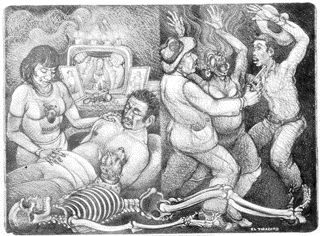 El Tiradito, by Luis Jiminez, 1996. Edition of 10 setone lithographs, 38×50 inches. Published by Coronado Studios. |
the difference between multiple original prints and mechanically reproduced
images of paintings or drawings, this show is still for you. In fact, it is
especially tailored for you. The museum provides information on the walls and
offers a one-page glossary of printmaking terms to bring the neophyte up to
speed. “A multiple-original work [is] made from a matrix or matrices (blocks,
stones, plates, screens, etc.) created by the artist expressly for this
purpose.” Several of the galleries contain printing presses and materials used
in the processes represented in this exhibition. The chop marks or shop logos
of each print shop are painted subtly on the walls of individual galleries. On
Sunday, February 23, the museum will sponsor a printmaking symposium featuring
Katherine Brimberry; Ken Hale, printmaker and acting chairman of UT’s
department of art and art history; Gilberto Cardenas, owner of Galeria Sin
Fronteras; Jonathan Bober, curator of prints and drawings for the Archer M.
Huntington Art Gallery; and special guest Bill Goldston, president of Universal
Limited Art Editions, an internationally renowned printshop. Artist Sydney
Yeager will speak in the galleries on March 6, and on April 3, Smith will talk
about the show. Then, on March 22, the museum will sponsor a tour of the
Coronado Studios, Flatbed Press, and UT Austin’s Guest Artists in Printmaking
Program. In other words, the museum’s responsibility to educate the community
and provide a forum for those already in the know is being attended to quite
nicely.
Although former museum director Daniel Stetson and former museum curator Peter
Mears conceived the idea for “Fresh Ink,” Smith, a co-founder of Flatbed Press
and the recently-appointed assistant to UT Dean of the College of Fine Arts,
was a natural choice to curate the exhibition after Stetson’s departure from
AMOA. Smith was there at the beginning. He was an active partner at Flatbed
when Jack Hanley “tortured” a large intaglio plate to achieve the richly
textured blood-red backdrop for Plague Doctor. Smith was instrumental in
producing Robert Levers’ Victory: The Celebration, a commentary on war.
And Smith officed at Flatbed when Strike Editions operated next door, along
with Ken Hale’s KJH Press. He is able to — and does — provide a solid
overview of the development of the contemporary print workshop and,
specifically, how Austin’s shops have enthusiastically joined in the production
of prints. The sheer quantity of work in the show — more than a hundred prints
— is only a fraction of what has been produced through these venues and firmly
establishes the impact of Austin’s print shops. Still, a second catalog essay
from an authority outside of Austin would have lent additional credibility to
Smith’s assertion that “`Fresh Ink’ demonstrates that the works generated in
Austin’s print workshops have reached a critical mass of artistic
importance.”
Arranging an exhibition as large as this one is a daunting task. The entire
exhibition space is filled with prints, with no single visual image or theme
uniting them. Serigraphy’s hard-edge images work in opposition to lithography’s
characteristic crayon drawings on stone and the subtle effects of an intaglio
over chine coll�. Do you arrange the work by medium? Hardly. “Once, the
specialties were segregated,” says Smith, “[but] now, whatever serves the image
best is used, in limitless combinations.” He gives as an example Michael Ray
Charles’s print Black Cats Go Off!, which includes aluminum-plate
photo-lithography, etching and aquatint, lino-cut, blind embossing, stenciling,
and hand-coloring. Julie Broberg’s deceptively simple Interior with White
Basin includes hand-coloring. Bogdan Perzynski’s Pleasure combines
collage and photo-lithography. (I used to have the pleasure of owning
Pleasure, and I miss it still.) Should the work be grouped in rooms
according to individual print shops? According to color or size? Maybe just
alphabetized by artist, beginning with “A”? No.
Arranging pictures in an exhibition requires, above all, a good eye. Friendly
dialogues between one print and the next need to be encouraged; “arguments”
between them should be discouraged. Each work has to be seen on its own terms,
to the extent possible, without interference from other prints. A grouping of
prints from Coronado Studios — including artists Leticia Huerta, Laura
Garanzuay, Pio Pulido, Candace Brice�o, and Deann Acton — is easy to
“read.” Their intense colors and themes echo the Latina exhibition which
preceded them in the same gallery space. But the museum missed entirely on the
placement of Roger Herman’s astonishing multi-panel, two-color woodblock. The
114″ x 601/2″ image serves more as decoration than as a coherent
image because you can’t stand back far enough to get a complete view. Gary
Washmon’s dark color linocut with monotype looms high like a vulture over four
smaller works, making it difficult really to see any one of them. The back
corner gallery with its green walls seems a bit too subdued. Strike Editions
and Galeria Sin Fronteras appear to have been segregated from the rest of the
show. Clearly, the exhibition is flawed; missed opportunities abound, but there
are few mortal sins. Frankly, there is so much fine work, I might have been
satisfied to have seen it leaning against the wall.
The curator’s statement posted on the wall suggests that while the purpose of
“Fresh Ink” is to explore the production of collaborative printmaking workshops
in Austin, the underlying reason he selected each work in the show was the
individual power of its image. In his catalog essay, Smith writes:
They are about content, not technique. We may relish the sensual nuances
of a print’s physical properties or be dazzled by a technical tour de force,
but in the end, it’s not technical ambition or virtuosity that we seek in a
print, but rather, the force of its meaning.
The catalog for the exhibition arrived in my mailbox a couple of days before
the opening reception, thanks to AMOA’s attentive public relations staff. The
production of a 48-page catalog — whether with black-and-white or color images
— is a major feat (and a not insubstantial expense) for any community museum.
Producing it in time for the opening is equally impressive. On the other hand,
I hate catalogs that make big work look small and precious (again, Roger
Herman suffers) and reproduce smaller prints in a scale that is totally out of
line with their actual size. This catalog scrambles the size and importance of
work in the show and falls substantially short of reproducing the bulk of
prints in the exhibition. Still, I noticed books flying off the gift shop
shelves at the opening, affirming the enthusiasm experienced by those who had
come to see the exhibition and wanted a remembrance to take with them. I am
certainly pleased to have my own copy, and not simply because I am mentioned
for having published several prints for gallery artists a long time ago.
I’ve visited the exhibition three times and still find fresh images in “Fresh
Ink.” So don’t wait for those out-of-town visitors before going to the museum.
Check out this show for yourself.
“Fresh Ink” continues through April 13 at the Austin Museum of Art,
Downtown, 823 Congress.
Rebecca S. Cohen is an arts writer and recovering art dealer.
This article appears in February 21 • 1997 and February 21 • 1997 (Cover).