The Evolution of The Austin Chronicle Logo
As we debut our print issue redesign, we revisit our changing masthead
By Nick Barbaro, Fri., Jan. 31, 2020


Summer 1981 - Oct. 30, 1981
In some ways, Micael Priest's hand-lettered original remains our most beloved logo – we still use a simplified version of it in promotional materials – but it only lasted for five issues in the publication itself (six if you count the prototype). Art Director Jason Stout: "A couple of years ago I started to redraw this logo digitally to explore retooling it and reincorporating it into a new one. I soon realized I was robbing it of everything that makes it so cool."
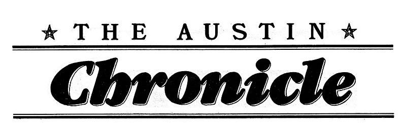
Nov. 13, 1981 - Sept. 7, 1984
But even though we loved that Old English-inspired script, we decided we needed a more modern image for the go-go Eighties. This logo debuted on a Friday the 13th in our Issue #6, a special issue on the newly cool scene on East Sixth Street. It's also by Priest, who was brilliant at hand lettering – this was a playful version of the popular typeface Souvenir – though it wasn't his favorite work to do. The top line was typeset, and was held over into the next version of the logo, reversed out of black.
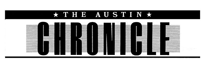
Sept. 21, 1984 - Dec. 23, 1995
I don't really remember anything about how this logo came about, but it was the first one to last over a decade. We originally intended the new design to come out for the third anniversary, but didn't quite have it together in time, so pushed it back one issue. This issue also marked the debut in the staff box of "Art Guy" Paul Sabal, who did design work, including cover designs, for about a year under Art Director Kathy Claps, so maybe he did the logo too. This is also the logo that the neon sign hanging on our building is based on. The lines in the background were always difficult at small sizes, though. ...

Jan. 6, 1995 - July 25, 2008
Former Art Director Ben Davis: "At the time we were still fairly new to desktop publishing, and the original logo had to be layered onto cover art by copying it on the giant photo stat camera in the darkroom. I thought it would be fun to have something dense enough that it would be readable in various applications: reversing out of a photo, etc. We had subscriptions to the big alt-weeklies from around the country, and I really dug the mastheads from papers like the SF Bay Guardian and Newcity.
"I had recently taken a trip to Hatch Show Print in Nashville and was inspired by the amazing woodblock circus posters and Elvis memorabilia. After trying and failing to replicate some of those amazing 80-year-old fonts, I tried making something a little more quirky with the flanges on the letters and the slanted cut on the 'C.' The 'Candybar' had a great run, but I always felt the urge to tweak it when I saw it scaled up. Now I won't think about whether or not I should have tweaked that kerning just one more time before saving ..."

Aug. 1, 2008 - Jan. 24, 2020
Stout: "Well, Ben, I tweaked that kerning, for better or worse. At some point, unless letter spacing is obviously wrong (which it wasn't), kerning becomes a bottomless pit of second-guessing. I trudged around in the mire of that pit for a while. This wasn't a full redesign, but moving 'The Austin' to the side made the whole thing more unified and more flexible for various uses online and in ads and promo materials. It was fun to reverse engineer how Ben created the type, but making the 'S' was a huge pain in the ass. Also, I quickly got tired of looking at it sideways."

Jan. 31, 2020 - ???
Stout: "When Trump won the election, I got pretty fired up about his 'fake news' nonsense. I wanted to give a boost to the very true newspeople I work for (and the community they serve with their stories) by graphically restating who we are. What I tried to get to with the new logo was both a distillation of our previous logos and a fresh, bold, solid mark that carries the weight of our history and carries us into the future. My hope is that it reflects that special balance of journalistic integrity and playful eccentricity that makes the Chronicle so authentic."